资源
正文
在 Astro 中使用 shadcn/ui
创建 Astro 项目
npm create astro@latest my-astro-app
cd my-astro-app
npm install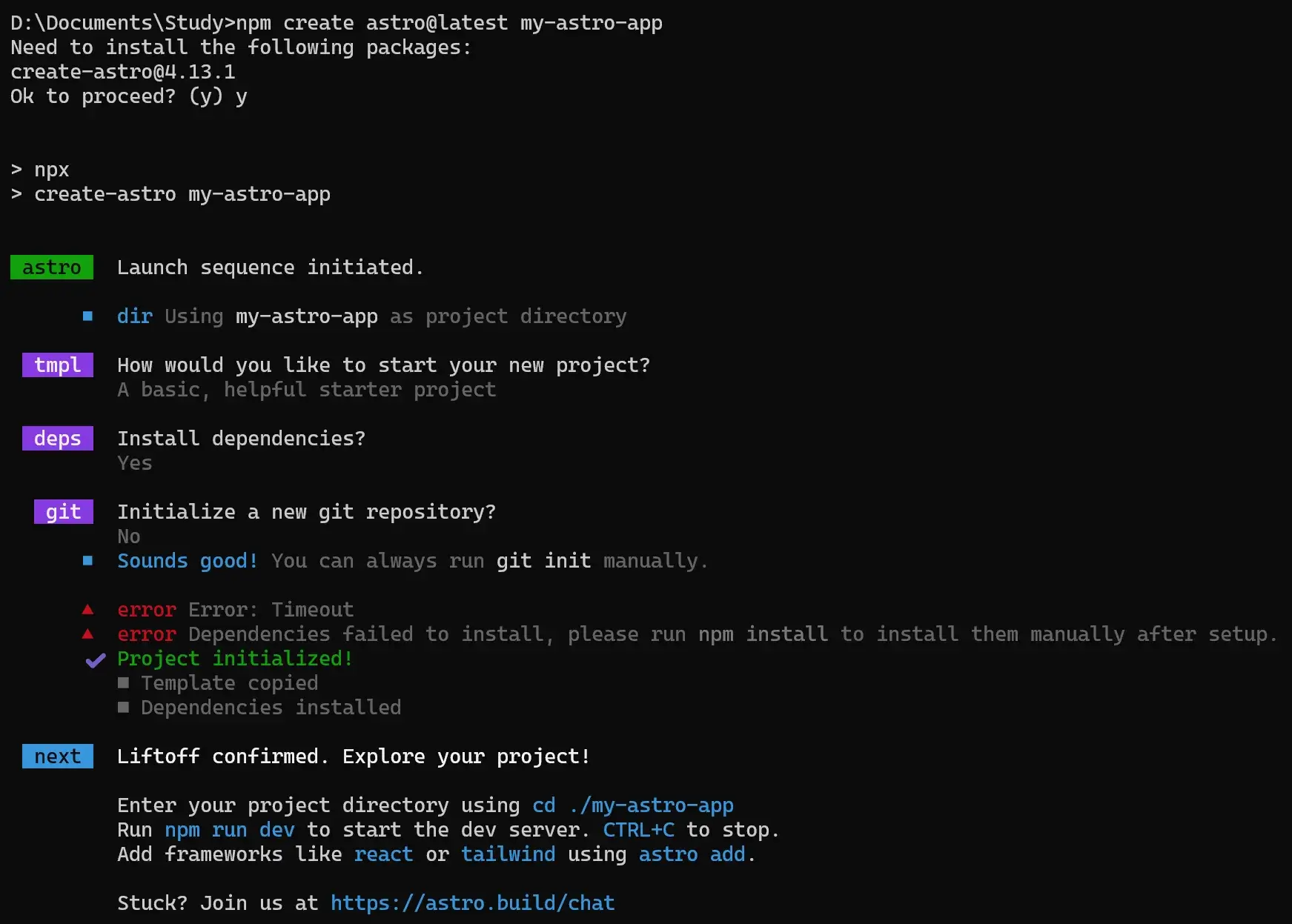
进入项目,安装 Tailwind
cd my-astro-app
npx astro add tailwind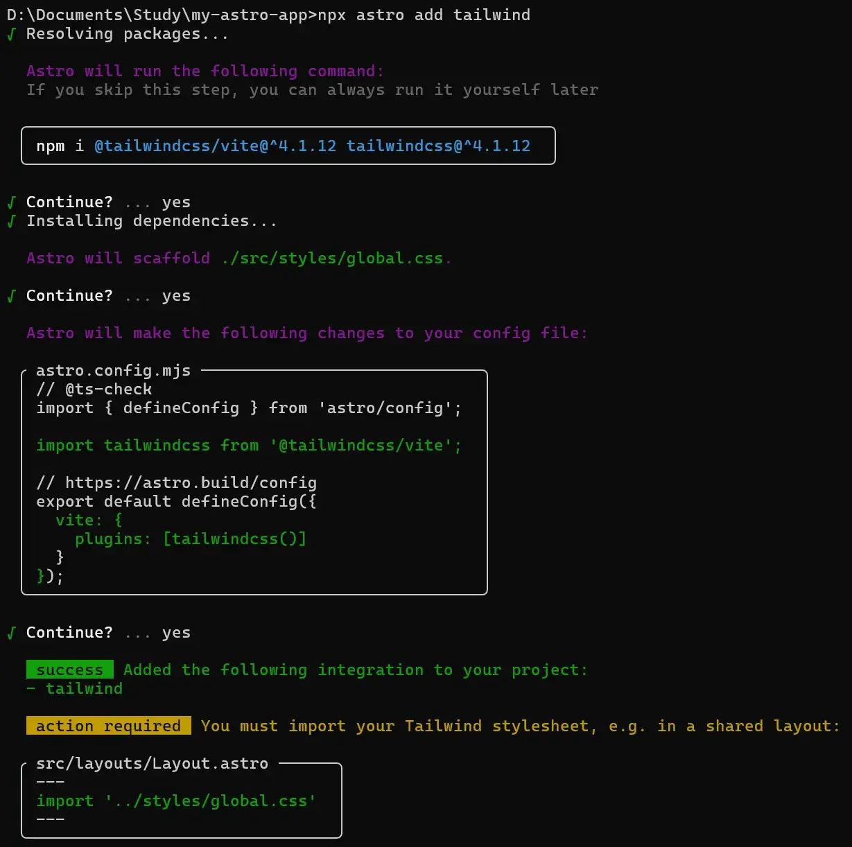
注意
安装依赖
它帮你装了:
@tailwindcss/vite(用于 Vite 插件整合)tailwindcss
生成样式文件
它在 src/styles/global.css 里生成了一个空的 全局样式入口文件,Tailwind 会在这里初始化。
修改配置文件
它修改了 astro.config.mjs,加上了:
import tailwindcss from '@tailwindcss/vite';

export default defineConfig({
  vite: {
    plugins: [tailwindcss()]
  }
});
这表示 Vite 会用 Tailwind 插件来处理样式。
额外操作(action required)
==Tailwind 的样式文件不会自动生效,你需要在项目中 显式引入 global.css。==
比如在你的公共布局文件 src/layouts/Layout.astro 里加:
---
import '../styles/global.css';
---
<html lang="en">
  <body>
    <slot />
  </body>
</html>
同样地,如果想修改 shadcn/ui 的样式,可以修改 global.css 里定义的变量。
安装 React
npx astro add react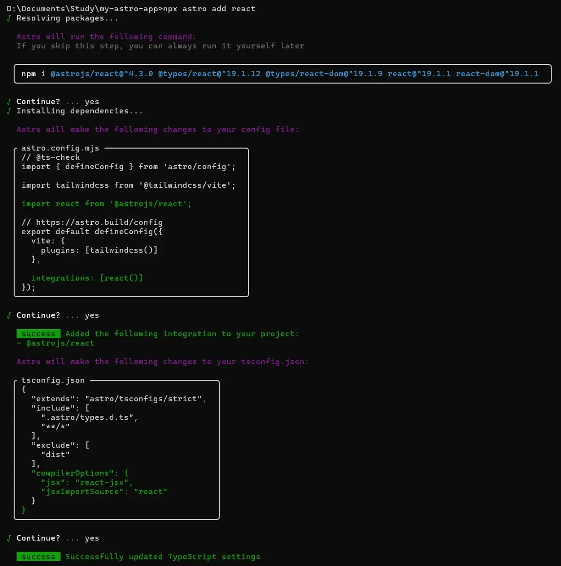
注意
安装依赖
npm i @astrojs/react@^4.3.0 @types/react@^19.1.12 @types/react-dom@^19.1.9 react@^19.1.1 react-dom@^19.1.1意思是:
@astrojs/react:Astro 的 React 集成包@types/react/@types/react-dom:React 的 TypeScript 类型声明react/react-dom:React 的核心库和 DOM 渲染库
安装后,你就能在 Astro 中写 React 组件了。
修改 astro.config.mjs
import tailwindcss from '@tailwindcss/vite';
import react from '@astrojs/react';

export default defineConfig({
  vite: {
    plugins: [tailwindcss()]   // 保留了 Tailwind
  },
  integrations: [react()]      // 加入 React 支持
});
解释:
- 这里已经启用了
@astrojs/react插件,Astro 会在构建时帮你处理 React 代码。 vite.plugins: [tailwindcss()]表明 Tailwind 依然存在,不会冲突。
修改 tsconfig.json
{
  "extends": "astro/tsconfigs/strict",
  "include": [
    ".astro/types.d.ts",
    "**/*"
  ],
  "exclude": [
    "dist"
  ],
  "compilerOptions": {
    "jsx": "react-jsx",          // TS 知道你写的是 React JSX
    "jsxImportSource": "react"   // JSX 语法用 React 来解释
  }
}
解释:
jsx: "react-jsx"→ 告诉 TypeScript 用 React 的新 JSX 转换方式。jsxImportSource: "react"→ JSX 默认从react引入,而不是preact或别的库。- 这样一来,
*.tsx文件可以正常编译。
最终效果
现在你可以:
-
在
src/components/下新建 React 组件(如Button.tsx)。 -
在
.astro文件里这样引入:astro --- import Button from '../components/Button.tsx'; --- <Button />
配置 shadcn
修改 ./tsconfig.json 里的内容:
{
  "extends": "astro/tsconfigs/strict",
  "include": [
    ".astro/types.d.ts",
    "**/*"
  ],
  "exclude": [
    "dist"
  ],
  "compilerOptions": {
    "jsx": "react-jsx",
    "jsxImportSource": "react",
    "baseUrl": ".",
    "paths": {
      "@/*": ["src/*"]
    }
  }
}
注意
这行配置的意思:当你写 import { Button } from "@/components/ui/button",它会去 src/components/ui/button 找。
npx shadcn@latest init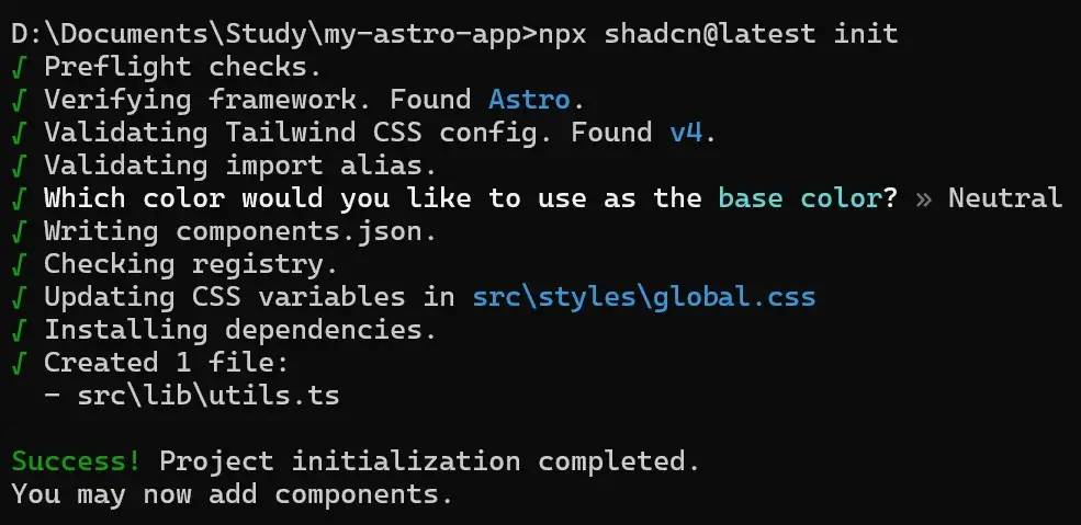
注意
npx shadcn@latest init 在 Astro 工程里主要做了两件事:
- 创建组件目录结构(
src/components/ui/)。 - 检查和提示环境问题(Tailwind、React、路径别名),并不会自动改动代码或安装依赖。
真正生成组件和依赖是在你执行:
npx shadcn@latest add button或其它组件的时候。
安装组件 button
npx shadcn@latest add button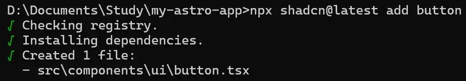
其实就是先检查环境是否配置正确,之后下载 src\components\ui\button.tsx:
import * as React from "react"
import { Slot } from "@radix-ui/react-slot"
import { cva, type VariantProps } from "class-variance-authority"

import { cn } from "@/lib/utils"

const buttonVariants = cva(
  "inline-flex items-center justify-center gap-2 whitespace-nowrap rounded-md text-sm font-medium transition-all disabled:pointer-events-none disabled:opacity-50 [&_svg]:pointer-events-none [&_svg:not([class*='size-'])]:size-4 shrink-0 [&_svg]:shrink-0 outline-none focus-visible:border-ring focus-visible:ring-ring/50 focus-visible:ring-[3px] aria-invalid:ring-destructive/20 dark:aria-invalid:ring-destructive/40 aria-invalid:border-destructive",
  {
    variants: {
      variant: {
        default:
          "bg-primary text-primary-foreground shadow-xs hover:bg-primary/90",
        destructive:
          "bg-destructive text-white shadow-xs hover:bg-destructive/90 focus-visible:ring-destructive/20 dark:focus-visible:ring-destructive/40 dark:bg-destructive/60",
        outline:
          "border bg-background shadow-xs hover:bg-accent hover:text-accent-foreground dark:bg-input/30 dark:border-input dark:hover:bg-input/50",
        secondary:
          "bg-secondary text-secondary-foreground shadow-xs hover:bg-secondary/80",
        ghost:
          "hover:bg-accent hover:text-accent-foreground dark:hover:bg-accent/50",
        link: "text-primary underline-offset-4 hover:underline",
      },
      size: {
        default: "h-9 px-4 py-2 has-[>svg]:px-3",
        sm: "h-8 rounded-md gap-1.5 px-3 has-[>svg]:px-2.5",
        lg: "h-10 rounded-md px-6 has-[>svg]:px-4",
        icon: "size-9",
      },
    },
    defaultVariants: {
      variant: "default",
      size: "default",
    },
  }
)

function Button({
  className,
  variant,
  size,
  asChild = false,
  ...props
}: React.ComponentProps<"button"> &
  VariantProps<typeof buttonVariants> & {
    asChild?: boolean
  }) {
  const Comp = asChild ? Slot : "button"

  return (
    <Comp
      data-slot="button"
      className={cn(buttonVariants({ variant, size, className }))}
      {...props}
    />
  )
}

export { Button, buttonVariants }
渲染组件
编辑 ./src/pages/index.astro:
---
import '../styles/global.css';
import { Button } from "@/components/ui/button";
---

<html lang="en">
  <head>
    <meta charset="UTF-8" />
    <title>Astro + shadcn Demo</title>
  </head>
  <body class="p-6">
    <h1 class="text-3xl font-bold mb-4">Astro + shadcn/ui 🚀</h1>
    <Button client:load>点我一下</Button>
  </body>
</html>
跑一下:
npm run dev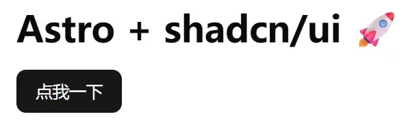
在 Astro + .mdx 中使用 shadcn/ui
在 Astro 项目中安装对 .mdx 渲染的支持:
npm install @astrojs/mdx修改 astro.config.mjs:
// @ts-check
import { defineConfig } from 'astro/config';

import mdx from '@astrojs/mdx';

import tailwindcss from '@tailwindcss/vite';

import react from '@astrojs/react';

// https://astro.build/config
export default defineConfig({
  vite: {
    plugins: [tailwindcss()]
  },

  integrations: [mdx(), react()]
});
将 src/pages/index.astro 替换为 src/pages/index.mdx:
import '@/styles/global.css';
import { Button } from "@/components/ui/button.tsx";
import {
  Card,
  CardAction,
  CardContent,
  CardDescription,
  CardFooter,
  CardHeader,
  CardTitle,
} from "@/components/ui/card";

# Astro + MDX + shadcn-ui 示例

下面是一个 **卡片** 示例:

<Card>
  <CardHeader>
    <CardTitle>Card Title</CardTitle>
    <CardDescription>Card Description</CardDescription>
    <CardAction>Card Action</CardAction>
  </CardHeader>
  <CardContent>
    <p>Card Content</p>
  </CardContent>
  <CardFooter>
    <p>Card Footer</p>
  </CardFooter>
</Card>

下面是一个 **按钮** 示例:

<Button client:load>点击我</Button>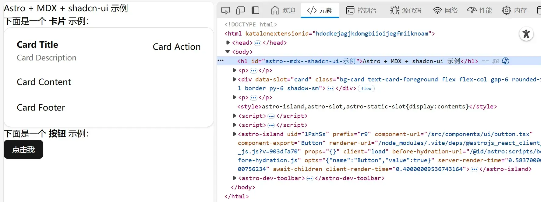
以后慢慢摸索吧……
更多组件
| 组件 | 功能说明 |
|---|---|
| Accordion | 可折叠面板,用于显示/隐藏内容。 |
| Alert | 简单的提示信息组件,常用于警告或通知。 |
| Alert Dialog | 带确认/取消操作的警告对话框。 |
| Aspect Ratio | 控制元素的宽高比。 |
| Avatar | 用户头像组件,可显示图片或首字母。 |
| Badge | 徽章,用于显示数量或状态标记。 |
| Breadcrumb | 面包屑导航,显示页面层级。 |
| Button | 按钮组件,用于触发操作。 |
| Calendar | 日历组件,用于选择日期或日期范围。 |
| Card | 卡片组件,用于信息展示。 |
| Carousel | 轮播图组件,用于图片或内容滑动展示。 |
| Chart | 图表组件,展示数据可视化。 |
| Checkbox | 多选框组件。 |
| Collapsible | 可折叠容器组件,与 Accordion 类似。 |
| Combobox | 可输入搜索的下拉选择框。 |
| Command | 命令面板组件,可快速执行操作。 |
| Context Menu | 右键菜单组件。 |
| Data Table | 数据表格组件,可排序、分页、选择等。 |
| Date Picker | 日期选择器组件。 |
| Dialog | 弹窗对话框组件,可显示内容和操作按钮。 |
| Drawer | 抽屉式侧边栏,用于展示额外内容。 |
| Dropdown Menu | 下拉菜单组件。 |
| React Hook Form | 表单集成,用于处理表单状态和验证。 |
| Hover Card | 悬停显示信息卡片。 |
| Input | 输入框组件。 |
| Input OTP | 一次性密码输入框,通常用于验证码输入。 |
| Label | 标签组件,用于表单字段说明。 |
| Menubar | 顶部或底部菜单栏组件。 |
| Navigation Menu | 导航菜单组件,用于页面跳转。 |
| Pagination | 分页组件。 |
| Popover | 弹出提示或内容的浮层组件。 |
| Progress | 进度条组件。 |
| Radio Group | 单选组组件。 |
| Resizable | 可拖拽改变大小的容器组件。 |
| Scroll-area | 可滚动区域容器。 |
| Select | 下拉选择组件。 |
| Separator | 分割线组件。 |
| Sheet | 底部滑出面板,类似抽屉。 |
| Sidebar | 侧边栏导航组件。 |
| Skeleton | 骨架屏组件,用于加载占位。 |
| Slider | 滑块组件,可调整数值。 |
| Sonner | 通知弹窗组件(toast/alert 风格)。 |
| Switch | 开关组件,二选一状态。 |
| Table | 表格组件,用于显示数据。 |
| Tabs | 标签页组件,用于切换内容。 |
| Textarea | 多行文本输入框。 |
| Toast | 消息提示弹窗。 |
| Toggle | 开关/切换按钮组件。 |
| Toggle Group | 多开关组合,用于多选或切换操作。 |
| Tooltip | 提示信息悬浮显示。 |
| Typography | 文字排版组件,控制字体、大小、行高等。 |