前言
拍的照片多了,设计一个相册功能便于更直观地展示拍的各种好看的照片😇!
参考资料:
- 新增相册页面 by PancrasL · Pull Request #32 · 79E/hexo-theme-quiet (github.com)
- 关于给hexo博客增加相册页面(实现瀑布流相册,实现加密相册) - 掘金 (juejin.cn)
- CSS实现瀑布流的两种方式 - 掘金 (juejin.cn)
- Masonry (desandro.com)
正文
子链接的创建
在 hexo 项目的 source 文件中,新建一个 galleries 文件夹,再在里面放上 index.md(可以使用命令行),
hexo new page gallery渲染博客的时候就会渲染 /galleries 这个网址,如 相册-Zi-Zi's Journey。
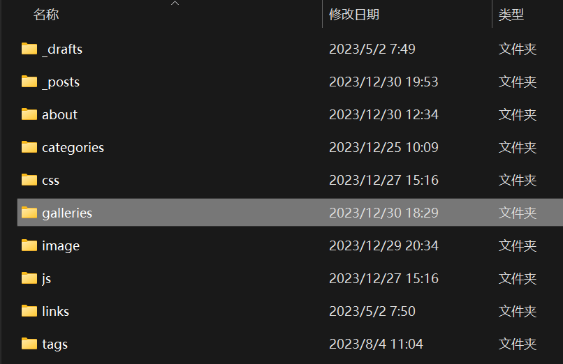
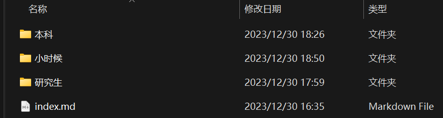
同样地,如果在 galleries 里放上其它文件夹,文件夹里再放上 index.md,渲染博客的时候就会再渲染下一级的网址,如:../../../../galleries/研究生 。
继续套娃,套到相册(layout 为 gallery)为止:
相册的入口
设置好了子链接就要设置好入口,一般在主题的 _config.yml 中配置。
# 导航名称
menus_title:
  home: 主页
  archives: 统计
  categories: 类别
  tags: 标签
  galleries: 相册
  links: 链接
  about: 关于

# 导航
menus:
  home: /
  archives: /archives
  categories: /categories
  tags: /tags
  galleries: /galleries
  links: /links
  about: /about
渲染博客,导航栏就多了一项 相册,且点进去能够正确转入 /galleries:

其它有关页面的参数也设置一下:
# 每个页面的展示的图标和一句话
headers:
home: {
message: "居然被你找到了这里!",
icon: "/images/logo.png",
cover: "#f5f9fd"
}
archives: {
# 这里会替换掉两个变量{ year 年,number 总数 } 当然也可以不写这两个变量
message: "居然用了 year 年一共才写了 number 篇文章!",
icon: "/images/archives.svg",
cover: "#f5f9fd"
}
categories: {
message: "好像也没分几类",
icon: "/images/categories.svg",
cover: "#f5f9fd"
}
tags: {
message: "这里是一些展示的标签",
icon: "/images/tags.svg",
cover: "#f5f9fd"
}
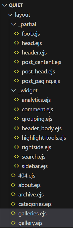
galleries: {
message: "有趣的相册~(施工中)",
icon: "/images/galleries.svg",
cover: "#f5f9fd"
}
links: {
message: "给我读过的学校递一杯卡布奇诺~",
icon: "/images/links.svg",
cover: "#f5f9fd"
}手撸一个风格相近的图标:
创建相册页面的布局
编辑创建的 index.md,头部信息是由 yaml 语法组成的:
title: 相册
date: 2023-12-29 09:46:29
type: galleries
layout: galleries
以自己所用主题为例,这表示这个网页页面布局将使用 galleries 渲染。
我设计了两种页面:
galleries用于展示相册gallery用于展示相册里的图片
在主题对应的文件夹里创建 galleries.ejs 和 gallery.ejs,页面就会按照对应的 .ejs 文件渲染:
galleries 设计
index.md
给使用 layout 为 galleries 的 index.md 设计变量,这些变量在galleries.ejs 中会以 page.XXX 的形式读取:
title: 相册
date: 2023-12-29 09:46:29
type: galleries
layout: galleries
layout_style: block
comments: false
galleries:
  - {title: "研究生", description: "Tell me 他乡的困难会不会比它鼓山高?", cover: "/images/gallery_covers/研究生.jpg"}
  - {title: "本科", description: "闽江江水都流向,流向长乐的海……", cover: "/images/gallery_covers/本科.jpg"}
- {title: "小时候", description: "我让过去的自己只留在,安静的白马河。", cover: "/images/gallery_covers/小时候.jpg"}title标题date时间,但在这里我并没用到type页面属性layout布局属性layout_style布局风格,我这里设计了两种风格block和cardgalleries相册列表,列表里的内容必须符合子文件夹的属性(我没有想到如何自动遍历子文件夹并获取相关参数的办法,只能这手动档了。)title相册标题description相册描述cover相册封面cover_style我这里没设置,可以控制封面图片的 style
comments是否打开评论功能
galleries.ejs
galleries.ejs 的内容参考如下:(修改 galleries.ejs 的内容要重新生成博客才可以重新渲染,如果调试不方便,可以将代码以 <%- partial('_partial/XXX' %> 跳转到其他地方以便于调试)
<%- partial('_partial/header',{name:'galleries'}) %>

<div class="galleries">
    <%- partial('_widget/header_body',{message: page.headers ? page.headers : theme.headers.galleries.message, icon:theme.headers.galleries.icon, cover: theme.headers.galleries.cover}) %>
    <div class="main">
        <div class="post-<%= page.layout_style ? page.layout_style : 'block' %>" id="content">
            <% page.galleries.forEach(function(item) { %>
                <div class="post-<%= page.layout_style ? page.layout_style : 'block' %>-content">
                    <a class="img-container" href="<%= item.title %>">
                        <div class="photo-frames">
                            <img style="<%- item.cover_style || '' %>" src="<%= item.cover ? item.cover : theme.default_cover %>" alt="Cover">
                        </div>
                        <p class="title"><%= item.title %></p>
                    </a>
                    <div class="description-container"><p><%= item.description %></p></div>
                </div>
            <% }); %>
            <div id="gitalk-container"></div>
        </div>
    </div>
</div>
就是将读取到信息展示在页面上的逻辑。
galleries.less
创建并编写对应的 galleries.less 如下(记得在一个地方引用):
.galleries{
	.main {
		display: flex;
		flex-grow: 1;
		flex-basis: auto;
		flex-direction: column;
		margin-top: -64px;
		.post-block{
			padding: 0 calc((100% - 1160px)/2);
			margin-bottom: 50px;
			&-content{
				margin: 20px 100px 60px 100px;
				text-decoration: none;
                height: 240px;
                justify-content: center; /* 添加此行以实现水平居中对齐 */
                display: grid;
                grid-template-columns: repeat(auto-fit, minmax(200px, 1fr));
                grid-gap: 10px; /* 控制子容器之间的间距 */
				position: relative;
				top: 0px;
				transition: all .5s ease-in-out;
				-moz-transition: all .5s;
				-webkit-transition: all .5s;
				-o-transition: all .5s;
				&:hover {
					top: -15px;
				}
                .img-container{
                    justify-content: center;
                    display: flex;
                    transform: rotate(-5deg);
                    transition: transform ease-in-out 0.5s;
                    &:hover {
                        transform: rotate(-10deg);
                    }
                    .photo-frames{
                        width: 200px;
                        border: 10px solid #FFF; /* 相框的边框样式和颜色 */
                        border-radius: 5px;
                        background: #FFF;
                        box-shadow: 0 20px 40px 0 rgba(50,50,50,0.2);
                        img{
                            border-radius: 2px;
                            margin-top: 10px;
                            width: 100%;
                            height: 75%;
                            object-fit: cover;
                        }
                    }
				}
                .title{
                    bottom: 15px;
                    position: absolute;
                    font-weight: bold;
                    text-decoration: none;
                    color: @textColorTheme;
                    font-size: 22px;
                    font-weight: 500;
                }
                .description-container{
                    margin-top: 80px;
                    p{
                        text-indent: 2em;
                        font-size: 20px;
                        position: absolute;
                    }
                }
			}
			@media screen and (max-width:660px) {
				&-content{
					margin: 20px;
					padding: 20px;
                    .title{
                        bottom: 5%;
                    }
                    .description-container{
                        p{
                            font-size: 18px;
                        }
                    }
				}
			}
            @media screen and (max-width:489px) {
				&-content{
                    height: 320px;
                    margin-bottom: 40px;
                    .img-container{
                        .photo-frames{
                            width: 60vw;
                        }
                    }
                    .description-container{
                        margin-top: 40px;
                    }
				}
			}
		}

        .post-card{
			display: flex;
			max-width: 100%;
			padding: 0 calc((100% - 1200px)/2) 40px;
			flex-wrap: wrap;
			justify-content: center;
			align-items: stretch;
			margin-top: -64px;
			&-content{
				margin: 20px 40px 80px 40px;
				text-decoration: none;
                height: 400px;
                justify-content: center; /* 添加此行以实现水平居中对齐 */
                display: grid;
                grid-template-columns: repeat(auto-fit, minmax(200px, 1fr));
                grid-gap: 10px; /* 控制子容器之间的间距 */
				position: relative;
				top: 0px;
				transition: all .5s ease-in-out;
				-moz-transition: all .5s;
				-webkit-transition: all .5s;
				-o-transition: all .5s;
				&:hover {
					top: -15px;
				}
                .img-container{
                    justify-content: center;
                    display: flex;
                    transform: rotate(-5deg);
                    transition: transform ease-in-out 0.5s;
                    &:hover {
                        transform: rotate(-10deg);
                    }
                    .photo-frames{
                        width: 220px;
                        border: 10px solid #FFF; /* 相框的边框样式和颜色 */
                        border-radius: 5px;
                        background: #FFF;
                        box-shadow: 0 20px 40px 0 rgba(50,50,50,0.2);
                        img{
                            border-radius: 2px;
                            margin-top: 10px;
                            width: 100%;
                            height: 75%;
                            object-fit: cover;
                        }
                    }
				}
                .title{
                    bottom: 20px;
                    position: absolute;
                    font-weight: bold;
                    text-decoration: none;
                    color: @textColorTheme;
                    font-size: 22px;
                    font-weight: 500;
                }
                .description-container{
                    margin-top: 40px;
                    p{
                        text-indent: 2em;
                        font-size: 20px;
                        position: absolute;
                    }
                }
			}

            @media screen and (max-width:640px) {
				&-content{
                    margin: 80px 20px;
					padding: 20px;
                    height: 400px;
                    .title{
                        bottom: 5%;
                    }
                    .img-container{
                        .photo-frames{
                            width: 60vw;
                        }
                    }
                    .description-container{
                        p{
                            font-size: 18px;
                        }
                    }
				}
			}
		}
	}
}
演示
大功告成,对应的 block 风格页面:相册-Zi-Zi's Journey
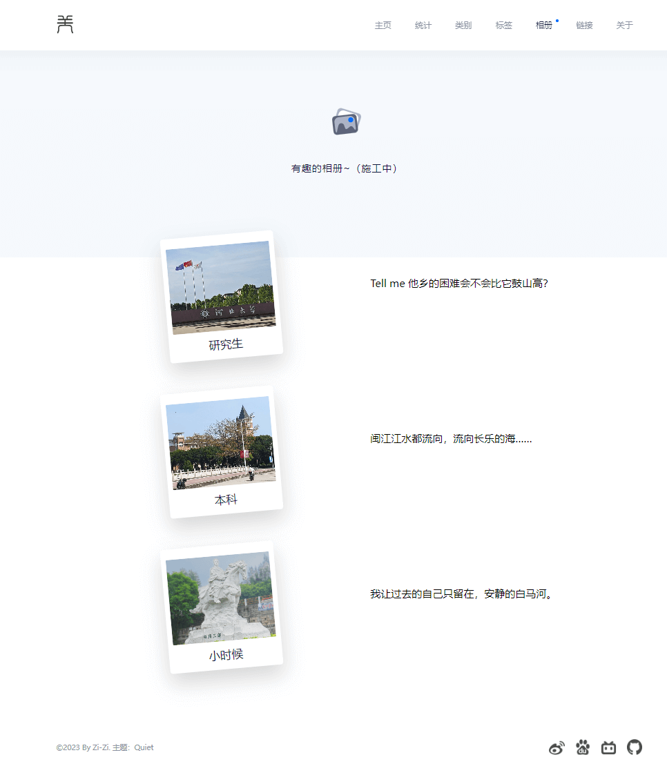
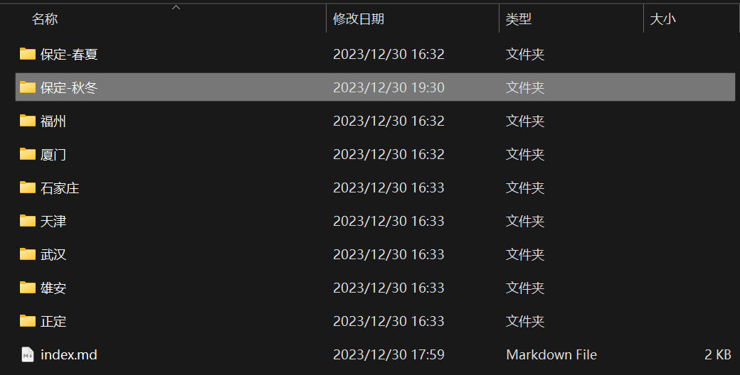
\研究生\index.md 的布局:
title: 研究生
date: 2023-12-29 14:47:00
type: galleries
layout: galleries
layout_style: card
headers: 大河之北
galleries:
  - {title: "福州", description: "WAIYA! 鼓山脚 南门兜 我如鱼得水", cover: "/images/gallery_covers/研究生/福州.jpg"}
  - {title: "保定-春夏", description: "保定没有爱情,只有他蜡笔还不完的饥荒。", cover: "/images/gallery_covers/研究生/保定-春夏.jpg"}
  - {title: "保定-秋冬", description: "雪花飘飘,北风萧萧。", cover: "/images/gallery_covers/研究生/保定-秋冬.jpg"}
  - {title: "石家庄", description: "直到大厦崩塌", cover: "/images/gallery_covers/研究生/石家庄.jpg"}
  - {title: "厦门", description: "再鼓楼润湖里搞涢涢!", cover: "/images/gallery_covers/研究生/厦门.jpg"}
  - {title: "武汉", description: "这辈子又可以见到小迷糊了!", cover: "/images/gallery_covers/研究生/武汉.jpg"}
  - {title: "雄安", description: "千年大计,国家大事。", cover: "/images/gallery_covers/研究生/雄安.jpg"}
  - {title: "天津", description: "天天乐道,津津有味。", cover: "/images/gallery_covers/研究生/天津.jpg"}
  - {title: "正定", description: "太能走了凡哥!", cover: "/images/gallery_covers/研究生/正定.jpg"}
对应的 card 风格页面:
gallery 设计
index.md
同理,给使用 layout 为 gallery 的 index.md 设计变量,这些变量在gallery.ejs 中会以 page.XXX 的形式读取:
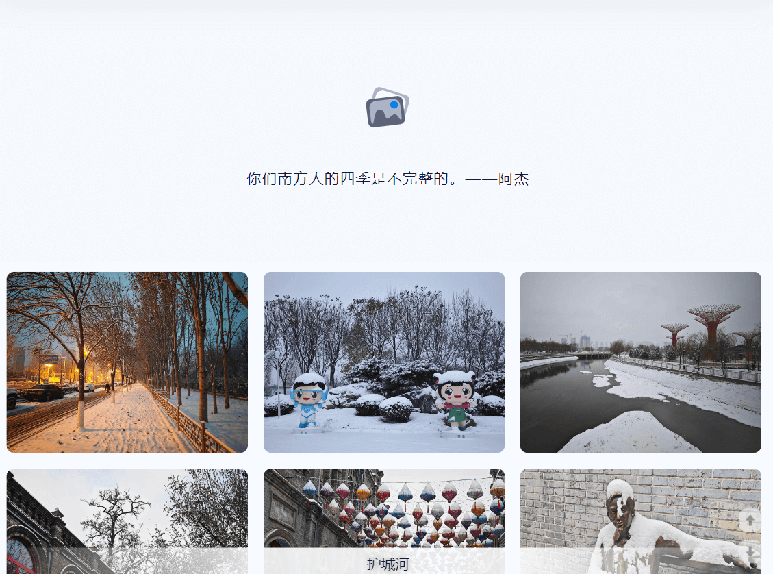
title: 保定-秋冬
date: 2023-12-29 14:47:00
type: gallery
layout: gallery
description: 你们南方人的四季是不完整的。——阿杰
imgs:
 - {title: "积雪的人行道", src: ../../../XXX.jpg}
 - ...
 - {title: "和美保定", src: ../../../XXX.jpg}
comments: true-
title标题 -
date时间,但在这里我并没用到 -
type页面属性 -
layout布局属性 -
description相册描述 -
imgs定义的一个图片类(暂且先设计一个变量)title图片的描述src对应的 src 地址,可以是绝对地址也可以是相对地址
-
comments是否打开评论功能
逐个输入图像链接是费劲的,可以考虑借助其他工具批量生成这样的信息。
批量生成这样的信息的代码:
import os

for file in os.listdir(r'D:\Study\GzBlog-Github\source\_posts\Diary-浙了(二)'):
    print(' ' + r'- {title: "XXX", src:  /2024/02/26/Diary-浙了(二)/' + file + '}')
gallery.ejs
在 gallery.ejs 中调用这些变量:
- 因为这个博客使用了 fancybox 便于轮播图片,所以将
<img>放在<a class="fancybox">下。 - 相册的布局是瀑布流布局,自己写可太费劲了,引用了 Masonry - imagesLoaded progress (codepen.io) 中的瀑布流插件。
- 保证引用的
masonry.pkgd.js和imagesloaded.pkgd.js版本一致,不然可能会出现奇奇怪怪的问题。masonry.pkgd.js取自 https://unpkg.com/masonry-layout@4/dist/masonry.pkgd.jsimagesloaded.pkgd.js取自 https://unpkg.com/imagesloaded@4/imagesloaded.pkgd.js
- 设计了一个
description-container用于存放图片的描述。 <script>var lazyLoad = <%= theme.lazyload %></script><%- js('js/gallery.js') %>貌似是个可行的 EJS 向 JS 传参的方法。
<%- partial('_partial/header',{name:'galleries'}) %>
<%- partial('_widget/header_body',{message: page.description ? page.description : theme.headers.galleries.message, icon:theme.headers.galleries.icon, cover: theme.headers.galleries.cover}) %>
<%- js('js/masonry.pkgd.js') %>
<%- js('js/imagesloaded.pkgd.js') %>
<style> *{ box-sizing: border-box; } </style>

<div class="gallery-content">
    <div class="grid">
        <div class="grid-sizer"></div>
        <% if (page.imgs && page.imgs.length > 0) { %>
            <% page.imgs.forEach(function(item) { %>
                <div class="grid-item">
                    <a href="<%- item.src %>"
                    title="<%- item.title %>"
                    data-src="<%- item.src %>"
                    class="fancybox"
                    data-fancybox="fancybox-gallery-img"
                    rel="article">
                        <img src="<%- item.src %>" alt="<%- item.title %>" />
                    </a>
                </div>
            <% }) %>
        <% } %>
    </div>
    <div style="width: 100%; height: 20px;"></div>
    <div class="description-container"><span></span></div>
    <div style="width: 100%; height: 20px;"></div>
    <div id="gitalk-container"></div>
</div>

<script>var lazyLoad = <%= theme.lazyload %></script>
<%- js('js/gallery.js') %>
gallery.less
同理,创建并编写对应的 galleriy.less 如下:
.gallery-content {
    width: 100%;
    padding: 2px 0;
    max-width: 1200px;
    margin: -64px auto auto auto;
    border-radius: 10px;
    background: #FFF;

    .grid:after {
        content: '';
        display: block;
        clear: both;
    }

    .grid-sizer,
    .grid-item {
        width: 33%;
    }

    .grid-item {
        float: left;
        padding: 10px;
    }

    .grid-item img {
        display: block;
        max-width: 100%;
        border-radius: 10px;
    }

    .fancybox:hover {
        z-index: 2;
        transform: scale(1.1);
    }

    .description-container {
        z-index: 2;
        position: sticky;
        width: 100%;
        left: 0;
        right: 0;
        height: 40px;
        bottom: 0;
        background: linear-gradient(to right, rgba(0, 0, 0, 0), rgba(255, 255, 255, 0.9), rgba(255, 255, 255, 0.9), rgba(0, 0, 0, 0));
        text-align: center;
        flex-direction: column;
        align-items: center;

        span {
            font-size: 18px;
            color: #12183A;
            text-shadow: 0 0 10px rgba(128, 128, 128, 0.8);
            position: absolute;
            bottom: 50%;
            left: 50%;
            transform: translate(-50%, 50%);
        }
    }

    // 屏幕宽度较小时(如手机端),只显示一列
    @media screen and (max-width: 660px) {
        .grid-sizer,
        .grid-item {
            width: 100%;
        }
    }
}
gallery.js
function initGallery()
因为设置了懒加载,在图片载入完毕的时候需要执行 $grid.masonry(); 以更新布局。
function initGallery()
{
    var $grid = $('.grid').masonry({
        itemSelector: '.grid-item',
        percentPosition: true,
        columnWidth: '.grid-sizer'
    });
    if(lazyLoad)
    {
        window.imageLazyLoadSetting = {
            onImageLoaded: function() {
            $grid.masonry();
            }
        };
    }
    else
    {
        // layout Masonry after each image loads
        $grid.imagesLoaded().progress(function() {
            $grid.masonry();
        });
    }
    galleryBottom();
}

$(document).ready(function() {
    initGallery();
});
function galleryBottom()
Javascript 代码如下:
- 对于移动端,获取当前屏幕中间的图片
title,显示到底边栏中。 - 对于电脑端,当鼠标移动到某张图片上时,将对应的
title显示到底边栏中。
function galleryBottom(){
    if (/Android|webOS|iPhone|iPad|iPod|BlackBerry|IEMobile|Opera Mini/i.test(navigator.userAgent))
    {
        var descriptionContainer = document.querySelector('.description-container span');
        document.addEventListener("scroll", function () {
            var title = getBottomTitle();
            descriptionContainer.textContent = title;
        }, 3000);
    }
    else {
        var galleryContent = document.querySelector('.grid');
        var descriptionContainer = document.querySelector('.description-container span');

        galleryContent.addEventListener('mouseover', function(event) {
            if (event.target.tagName.toLowerCase() === 'img') {
                var title = event.target.getAttribute('alt');
                descriptionContainer.textContent = title;
            }
        });

        galleryContent.addEventListener('mouseout', function(event) {
            if (event.target.tagName.toLowerCase() === 'img') {
                descriptionContainer.textContent = '';
            }
        });
    }

    function getBottomTitle() {
        var elements = document.querySelectorAll('.fancybox');
        var viewportHeight = window.innerHeight;
        var bottomElement = null;
        for (var i = 0; i < elements.length; i++) {
            var rect = elements[i].getBoundingClientRect();

            if (rect.bottom <= viewportHeight && (!bottomElement || rect.bottom > bottomElement.rect.bottom)) {
                bottomElement = {
                element: elements[i],
                rect: rect
                }
            }
        }
        if (bottomElement) {
            return bottomElement.element.title;
        }
    }
}
演示
大功告成,瀑布流相册的演示:
真是太棒了!其他功能,再慢慢设计,想到哪写到哪。
python 辅助
python 辅助生成 gallery 格式的相关信息:
import os

for file in os.listdir(r'D:XXX'):
    print(' ' + r'- {title: "XXX", src:  /XXX' + file + '}')