正文
2.1 基本用法
import matplotlib.pyplot as plt
import numpy as np
二维函数图像
x = np.linspace(-1, 1, 50)
y = 2 * x + 1
plt.plot(x, y)  # 录入数据
plt.show()  # 显示图片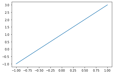
2.2 figure 图像
import matplotlib.pyplot as plt
import numpy as np
显示多个图像
x = np.linspace(-3, 3, 50)
y1 = 2 * x + 1
y2 = x ** 2

plt.figure()
plt.plot(x, y1)

plt.figure(num=3, figsize=(8, 5))
plt.plot(x, y2)
plt.plot(x, y1, color='red', linewidth=4.0, linestyle='--')

plt.show()
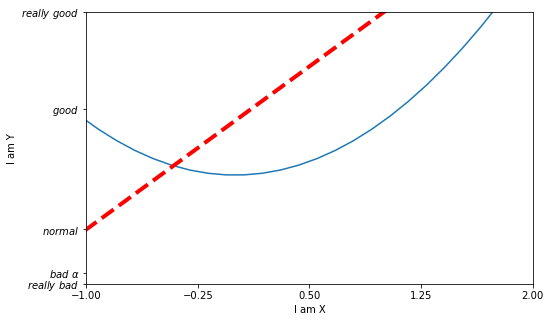
2.3 设置坐标轴 1
import matplotlib.pyplot as plt
import numpy as np

x = np.linspace(-3, 3, 50)
y1 = 2 * x + 1
y2 = x ** 2

plt.figure(num=3, figsize=(8, 5))
plt.plot(x, y2)
plt.plot(x, y1, color='red', linewidth=4.0, linestyle='--')

plt.xlim((-1, 2))  # 设置取值范围
plt.ylim((-2, 3))
plt.xlabel('I am X') # 设置坐标轴名称
plt.ylabel('I am Y')

new_ticks = np.linspace(-1, 2, 5)  # 设置单位范围
print(new_ticks)
plt.xticks(new_ticks)

plt.yticks([-2, -1.8, -1, 1.22, 3], [r'$really\ bad$', r'$bad\ \alpha$', r'$normal$', r'$good$', r'$really\ good$'])  # 设置单位标签

plt.show()
[-1. -0.25 0.5 1.25 2. ]
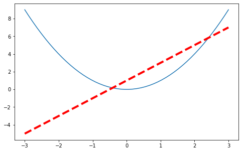
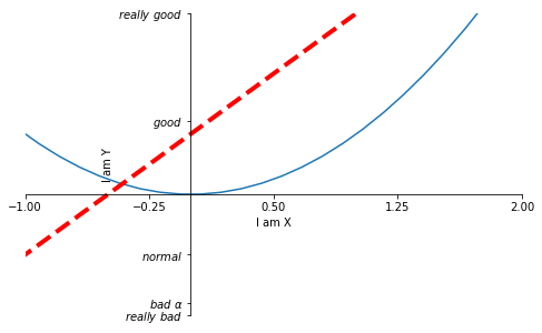
2.4 设置坐标轴 2
import matplotlib.pyplot as plt
import numpy as np

x = np.linspace(-3, 3, 50)
y1 = 2 * x + 1
y2 = x ** 2

plt.figure(num=3, figsize=(8, 5))
plt.plot(x, y2)
plt.plot(x, y1, color='red', linewidth=4.0, linestyle='--')

plt.xlim((-1, 2))  # 设置取值范围
plt.ylim((-2, 3))
plt.xlabel('I am X') # 设置坐标轴名称
plt.ylabel('I am Y')

new_ticks = np.linspace(-1, 2, 5)  # 设置单位范围
print(new_ticks)
plt.xticks(new_ticks)

plt.yticks([-2, -1.8, -1, 1.22, 3], [r'$really\ bad$', r'$bad\ \alpha$', r'$normal$', r'$good$', r'$really\ good$'])  # 设置单位标签

ax = plt.gca()
ax.spines['right'].set_color('none')  # 消失右端坐标轴
ax.spines['top'].set_color('none')  # 消失顶端坐标轴
ax.xaxis.set_ticks_position('bottom')  # 关联坐标轴
ax.yaxis.set_ticks_position('left')
ax.spines['bottom'].set_position(('data', 0))  # 修改原点位置
ax.spines['left'].set_position(('data', 0))

plt.show()
[-1. -0.25 0.5 1.25 2. ]
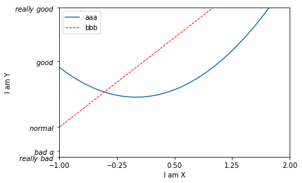
2.5Legend 图例
import matplotlib.pyplot as plt
import numpy as np

x = np.linspace(-3, 3, 50)
y1 = 2 * x + 1
y2 = x ** 2

plt.xlim((-1, 2))  # 设置取值范围
plt.ylim((-2, 3))
plt.xlabel('I am X') # 设置坐标轴名称
plt.ylabel('I am Y')

new_ticks = np.linspace(-1, 2, 5)  # 设置单位范围
print(new_ticks)
plt.xticks(new_ticks)

plt.yticks([-2, -1.8, -1, 1.22, 3], [r'$really\ bad$', r'$bad\ \alpha$', r'$normal$', r'$good$', r'$really\ good$'])  # 设置单位标签

l1, = plt.plot(x, y2, label='up')  # 设置图例
l2, = plt.plot(x, y1, color='red', linewidth=1.0, linestyle='--', label='down')
plt.legend(handles=[l1, l2,], labels=['aaa', 'bbb'] , loc='best')  # 显示图例

plt.show()
[-1. -0.25 0.5 1.25 2. ]
2.6 Annotation 标注
import matplotlib.pyplot as plt
import numpy as np

x = np.linspace(-3, 3, 50)
y = 2 * x + 1

plt.figure(num=1, figsize=(8, 5),)
plt.plot(x, y,)

ax = plt.gca()
ax.spines['right'].set_color('none')
ax.spines['top'].set_color('none')
ax.xaxis.set_ticks_position('bottom')
ax.spines['bottom'].set_position(('data', 0))
ax.yaxis.set_ticks_position('left')
ax.spines['left'].set_position(('data', 0))

x0 = 1
y0 = 2 * x0 + 1
plt.scatter(x0, y0, s=50, color='b') # 显示点(1, 3)
plt.plot([x0, x0], [y0, 0], 'k--', lw=2.5)  # 绘制黑色虚线

plt.annotate(r'$2x+1=%s$' % y0, xy=(x0, y0), xycoords='data', xytext=(+30, -30),
             textcoords='offset points', fontsize=16, arrowprops=dict(arrowstyle='->',
              connectionstyle='arc3, rad=.2'))  # 输入注释

plt.text(-3.7, 3, r'$This\ is\ the\ some\ text.\ \mu\ \sigma_i\ \alpha_t$',
        fontdict={'size': 16, 'color': 'r'})

plt.show()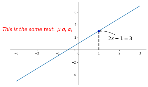
2.7 tick 能见度
import matplotlib.pyplot as plt
import numpy as np

x = np.linspace(-3, 3, 50)
y = 0.1 * x

plt.figure()
plt.plot(x, y, lw=10)
plt.ylim(-2, 2)

ax = plt.gca()
ax.spines['right'].set_color('none')
ax.spines['top'].set_color('none')
ax.xaxis.set_ticks_position('bottom')
ax.spines['bottom'].set_position(('data', 0))
ax.yaxis.set_ticks_position('left')
ax.spines['left'].set_position(('data', 0))

for label in ax.get_xticklabels() + ax.get_yticklabels():
    label.set_fontsize(12)
    label.set_bbox(dict(facecolor='yellow', edgecolor='None', alpha=0.7))

plt.show()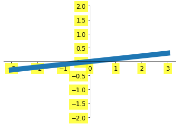
3.1 Scatter 散点图
import matplotlib.pyplot as plt
import numpy as np

n = 1024
X = np.random.normal(0, 1, n)
Y = np.random.normal(0, 1, n)
T = np.arctan2(Y, X)  # 只是为了好看
plt.scatter(X, Y, s=75, c=T, alpha=0.5)
plt.xlim((-1.5, 1.5))
plt.ylim((-1.5, 1.5))
plt.xticks(())  # 隐藏所有的 xticks
plt.yticks(())

plt.show()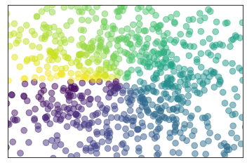
3.2 Bar 柱状图
import matplotlib.pyplot as plt
import numpy as np

n = 12
X = np.arange(n)
Y1 = (1 - X / float(n) * np.random.uniform(0.5, 1.0, n))
Y2 = (1 - X / float(n) * np.random.uniform(0.5, 1.0, n))

plt.bar(X, +Y1, facecolor="#9999ff", edgecolor="white")  # 向上的柱状图
plt.bar(X, -Y2, facecolor="#ff9999", edgecolor="white")  # 向下的柱状图

for x, y in zip(X, Y1):  # zip 把 X,Y1 分别传给 x, y
    # ha: horizontal alignment
    plt.text(x, y + 0.05, '%.2f' % y, ha='center', va="bottom")
for x, y in zip(X, Y2):  # zip 把 X,Y1 分别传给 x, y
    # ha: horizontal alignment
    plt.text(x, -y - 0.2, '%.2f' % -y, ha='center', va="bottom")

plt.xlim(-0.5, n)
plt.xticks(())
plt.ylim(-1.25, 1.25)
plt.yticks(())

plt.show()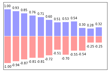
3.3 Contours 等高线图
import matplotlib.pyplot as plt
import numpy as np


def f(x, y):
    return (1 - x / 2 + x ** 5 + y ** 3) * np.exp(-x ** 2 - y ** 2)


n = 256
x = np.linspace(-3, 3, n)
y = np.linspace(-3, 3, n)
X, Y = np.meshgrid(x, y)  # 把 x 和 y 绑定成网格的输入值

plt.contourf(X, Y, f(X, Y), 8, alpha=0.75, cmap=plt.cm.hot)
C = plt.contour(X, Y, f(X, Y), 8, colors='black')

plt.clabel(C, inline=True, fontsize=10)

plt.xticks(())
plt.yticks(())
plt.show()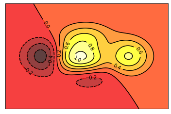
3.4 Image 图片
import matplotlib.pyplot as plt
import numpy as np

a = np.array(np.random.random(9)).reshape(3, 3)  # 图片
a.sort()
plt.imshow(a, interpolation="none", cmap='bone', origin='lower')
plt.colorbar(shrink=0.9)

plt.xticks(())
plt.yticks(())
plt.show()
3.5 3D 数据
import numpy as np
import matplotlib.pyplot as plt
from mpl_toolkits.mplot3d import Axes3D

fig = plt.figure()  # 新建一个 figure 窗口
ax = Axes3D(fig, auto_add_to_figure=False)  # 添加三维坐标轴
fig.add_axes(ax)

# 输入数据
X = np.arange(-4, 4, 0.25)
Y = np.arange(-4, 4, 0.25)
X, Y = np.meshgrid(X, Y)
R = np.sqrt(X ** 2 + Y ** 2)
Z = np.sin(R)

ax.plot_surface(X, Y, Z, rstride=1, cstride=1, cmap=plt.get_cmap('rainbow'))
ax.contourf(X, Y, Z, zdir='z', offset=-2, cmap='rainbow')
ax.set_zlim(-2, 2)

plt.show()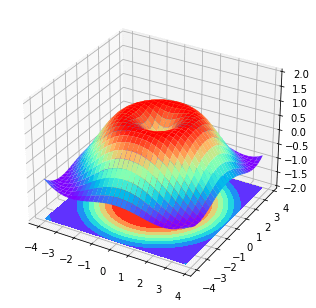
4.1 Subplot 多合一显示
import matplotlib.pyplot as plt

plt.figure()

plt.subplot(2, 1, 1)  # 将整个 figure 分成 2 行 1 列,第一张图
plt.plot([0, 1], [0, 1])

plt.subplot(2, 3, 4)
plt.plot([0, 1], [0, 2])

plt.subplot(235)
plt.plot([0, 1], [0, 3])

plt.subplot(236)
plt.plot([0, 1], [0, 4])

plt.show()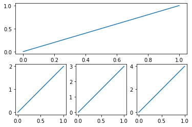
4.2 Subplot 分隔显示
import matplotlib.pyplot as plt
import matplotlib.gridspec as gridspec# method 1: subplot2grid
plt.figure()
ax1 = plt.subplot2grid((3, 3), (0, 0), colspan=3, rowspan=1)
ax1.plot([1, 2], [1, 2])
ax1.set_title("ax1_title")
ax2 = plt.subplot2grid((3, 3), (1, 0), colspan=2, rowspan=1)
ax3 = plt.subplot2grid((3, 3), (1, 2), colspan=1, rowspan=2)
ax4 = plt.subplot2grid((3, 3), (2, 0), colspan=1, rowspan=1)
ax5 = plt.subplot2grid((3, 3), (2, 1), colspan=1, rowspan=1)
plt.tight_layout()
plt.show()

# method 2: gridspec
plt.figure()
gs = gridspec.GridSpec(3, 3)
ax1 = plt.subplot(gs[0, :])
ax2 = plt.subplot(gs[1, :2])
ax3 = plt.subplot(gs[1:, 2])
ax4 = plt.subplot(gs[-1, 0])
ax5 = plt.subplot(gs[-1, -2])

plt.tight_layout()
plt.show()

# method 3: easy to define structure
f, ((ax11, ax12), (ax21, ax22)) = plt.subplots(2, 2, sharex=True, sharey=True)
ax11.scatter([1, 2], [1, 2])

plt.tight_layout()
plt.show()
4.3 图中图
import matplotlib.pyplot as plt

fig = plt.figure()
x = [1, 2, 3, 4, 5, 6, 7]
y = [1, 3, 4, 2, 5, 8, 6]

left, bottom, width, height = 0.1, 0.1, 0.8, 0.8
ax1 = fig.add_axes([left, bottom, width, height])
ax1.plot(x, y, 'r')
ax1.set_xlabel('x')
ax1.set_ylabel('y')
ax1.set_title('title')

left, bottom, width, height = 0.2, 0.6, 0.25, 0.25
ax2 = fig.add_axes([left, bottom, width, height])
ax2.plot(y, x, 'b')
ax2.set_xlabel('x')
ax2.set_ylabel('y')
ax2.set_title('title inside 1')

plt.axes([0.6, 0.2, 0.25, 0.25])
plt.plot(y[::-1], x, 'g')
plt.xlabel('x')
plt.ylabel('y')
plt.title('title inside 2')


plt.show()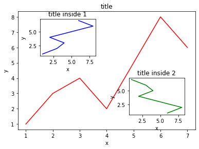
4.4 次坐标轴
import matplotlib.pyplot as plt
import numpy as npx = np.arange(0, 10, 0.1)
y1 = 0.05 * x ** 2
y2 = -1 * y1
fig, ax1 = plt.subplots()
ax2 = ax1.twinx() # 把 ax1 的坐标轴镜像翻转
ax1.plot(x, y1, 'g-')
ax2.plot(x, y2, 'b--')
ax1.set_xlabel('X data')
ax1.set_ylabel('Y1', color='g')
ax2.set_ylabel('Y2', color='b')
plt.show()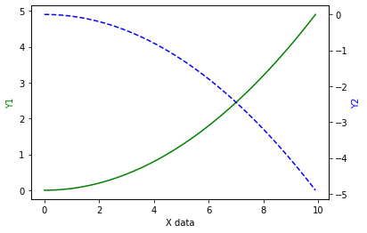
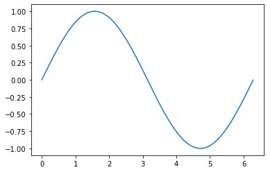
5.1 Animation 动画
import numpy as np
from matplotlib import pyplot as plt
from matplotlib import animationfig, ax = plt.subplots()
x = np.arange(0, 2 * np.pi, 0.01)
line, = ax.plot(x, np.sin(x))
def animate(i):
line.set_ydata(np.sin((x + i / 10)))
return line,
def init():
line.set_ydata(np.sin(x))
return line,
ani = animation.FuncAnimation(fig=fig, func=animate, frames=100, init_func=init, interval=20, blit=True)
plt.show()